
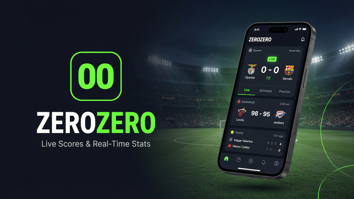
I have a confession: I’m putting an ad on ZeroZero, my sports site. I know. I swore I never would. I said it out loud, to people, with conviction.
Then the hosting bill arrived, and it turns out servers do not accept “good vibes” or “a passion for sports” as payment. Their loss, honestly. So, in the interest of keeping the lights on, I could use a little revenue to pay for hosting. Not a yacht. Not even a small boat. Just enough to cover the monthly invoice so I can keep building things nobody asked for.
Since I’m going to do this, I want to do it without turning the site into a casino billboard. The goal is a simple tension: the ad has to be visible enough to earn and quiet enough that you still want to visit. Here are the techniques I’m playing with.
1. Place it where eyes already go
Readers scan in predictable patterns, so I’m putting the unit near natural pauses instead of in the middle of the action:
- Below the first content block. Users see the real content first, then hit the ad as a natural breakpoint. Above-the-fold placement tends to pay more, but a banner that pushes scores off-screen is a good way to teach people to leave.
- Between content sections. Between game cards or standings tables, the ad reads as a divider and not an interruption.
- End of content. People who scroll to the bottom are engaged. They’re also the most likely to forgive you.
2. Reserve the space so nothing jumps
The most annoying thing an ad can do is load late and shove the page down just as you go to tap something. That’s layout shift, and it’s a UX crime as well as a Core Web Vitals penalty. The fix is to give the ad slot a fixed min-height (or an aspect-ratio) before the ad arrives, so the page doesn’t move when it does.
.ad-slot {
  min-height: 250px;      /* match the ad size you request */
  display: grid;
  place-items: center;
  margin: 2rem auto;
}
3. Label it honestly and give it room
A small, quiet “Advertisement” label, with some breathing room around the unit, builds trust. Hiding an ad so it looks like content is a short-term trick that irritates readers and can get you in trouble with ad networks. The ad should look like an ad, politely.
4. Lazy-load what’s below the fold
Ads are heavy: scripts, trackers, and creative assets. Loading them only as they approach the viewport (with IntersectionObserver, or the network’s built-in lazy loading) keeps the initial page fast. A fast sports site with one ad beats a slow sports site with zero, because nobody waits around to see either.
5. Be careful with sticky and anchored units
A sticky unit stays in view and earns well, which is exactly why it can be so irritating. If I use one, it’ll be a slim bottom anchor on mobile with an obvious close button, and not a giant floating rectangle that covers the score I came for. I’ll test it on a real phone before deciding it stays.
6. Measure, then move it
I don’t actually know the best spot, and neither does anyone else. I’ll start with one unit, watch viewability, bounce rate, and time on page, then nudge it up, down, or out. If a placement earns a few extra cents but costs me readers, it’s a bad trade.
The plan
One unit. Reserved space. Clearly labeled. Lazy-loaded. No pop-ups, no auto-playing video, no “one weird trick.” If you notice it, I want it to be because you chose to look.
If you stop by ZeroZero and the ad ever gets in your way, tell me. And if you happen to click one now and then, well, my hosting provider and I are very grateful.